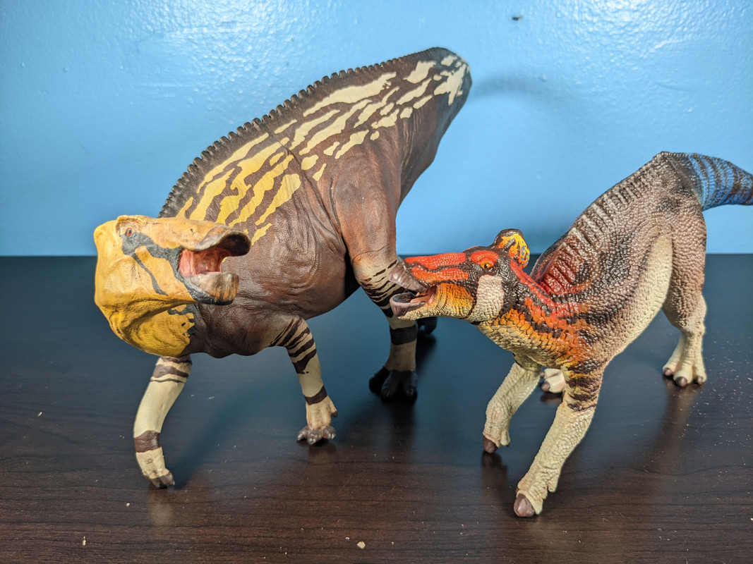
Hadrosaurs, in my mind, have always come across as some do the most colorful dinosaurs. I think this may be a side product of being exposed to Luis Rey’s art ever since I was young, but to me a drab hadrosaur just seems plain wrong. That was the case with CollectA’s Edmontosaurus. I’ve had issues with CollectA’s paint schemes before, they’re either too simple or add just one too many colors to look cohesive. This was the latter. That green just looked so out of place; I would have preferred them try to do something more simple.
Before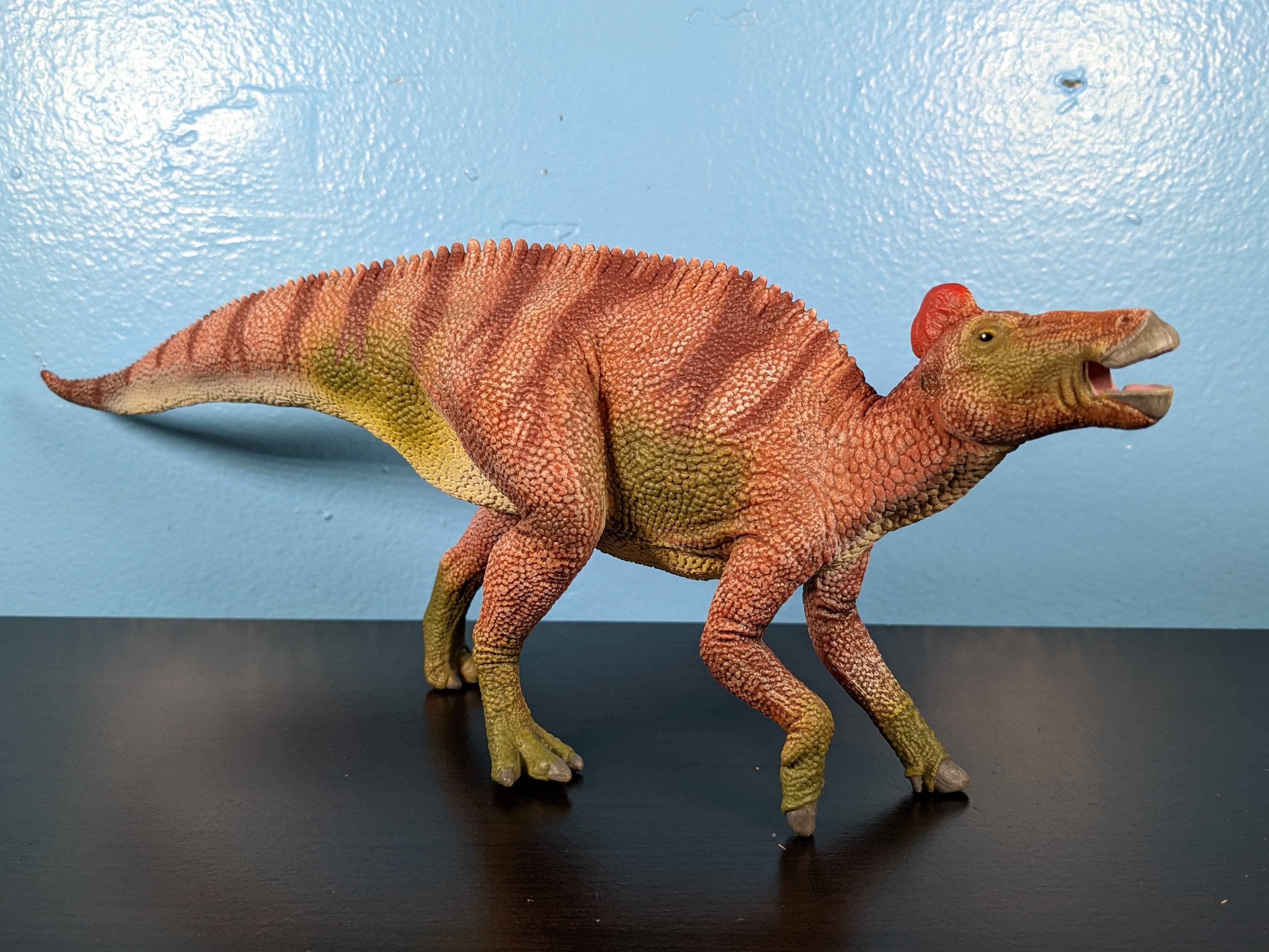 After
After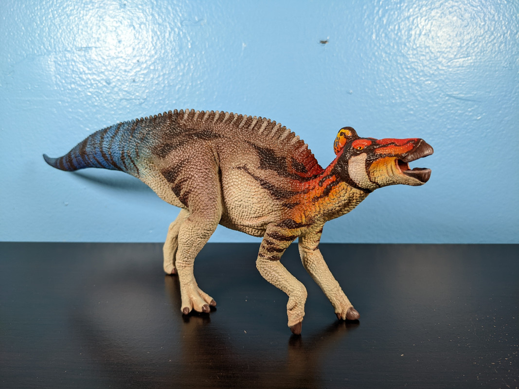
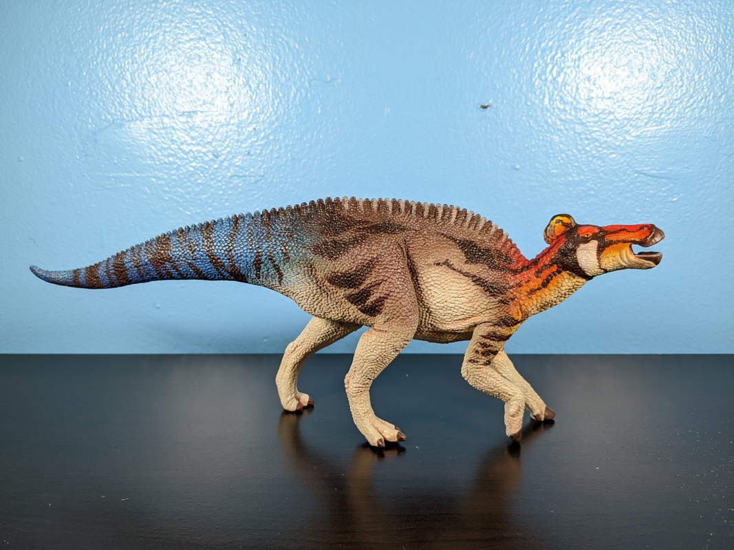
When pitching the idea of a repaint to Dinosaur Toy Forum member, paintingdinos, I fell in love with the notion referencing animals that currently live where the fossils were found. It’s not only a nice homage, but also allows for realistic looking references and some unique combinations of their features. The head and tail colors come from a Common five-lined skink, while the white underbelly and facial patterns owe a lot to the Pronghorn, and of course the vicious Canadian Goose inspired the black and gray patterns along the back.
 “Where you’re going is the only place in the world where the geese chase you.” - Ian Malcolm
The banding along the tail was also very important to get down as well and I think it looks so lovely paired with the blue. When going for such a flashy and diverse color scheme, I think it’s easy to make the figure look disjointed, but that’s not the case here. Nothing ever feels abrupt; paintingdinos made each color blend so seamlessly into the next.
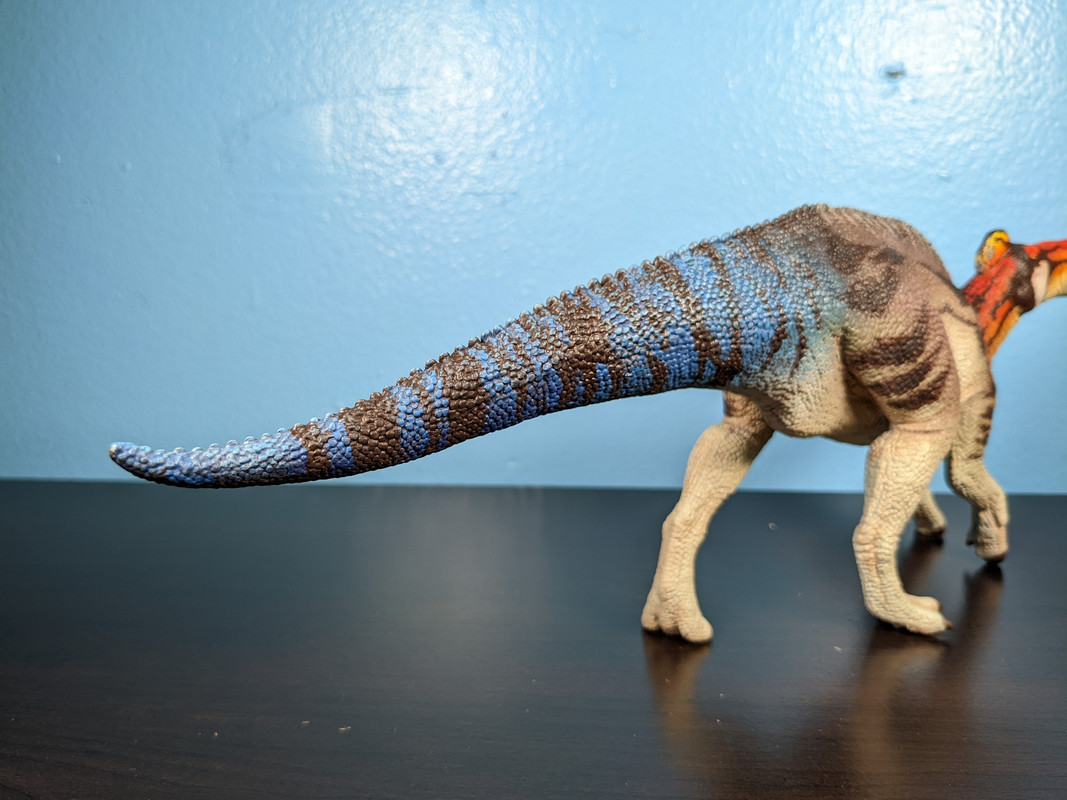
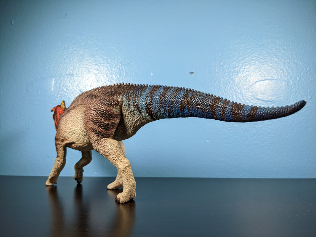
A huge shout out has to be given to those horizontal stripes she put along the body; they create a strong sense of unity as they extend between colors. Along the with darker greys on the torso, they provide a nice grounded contrast, and give this animal an intimidating presence. Really, come to think of it, there aren’t enough dinosaur models with darker color schemes (I’m getting a little sick or every figure being brown or green).
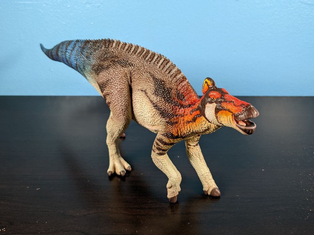
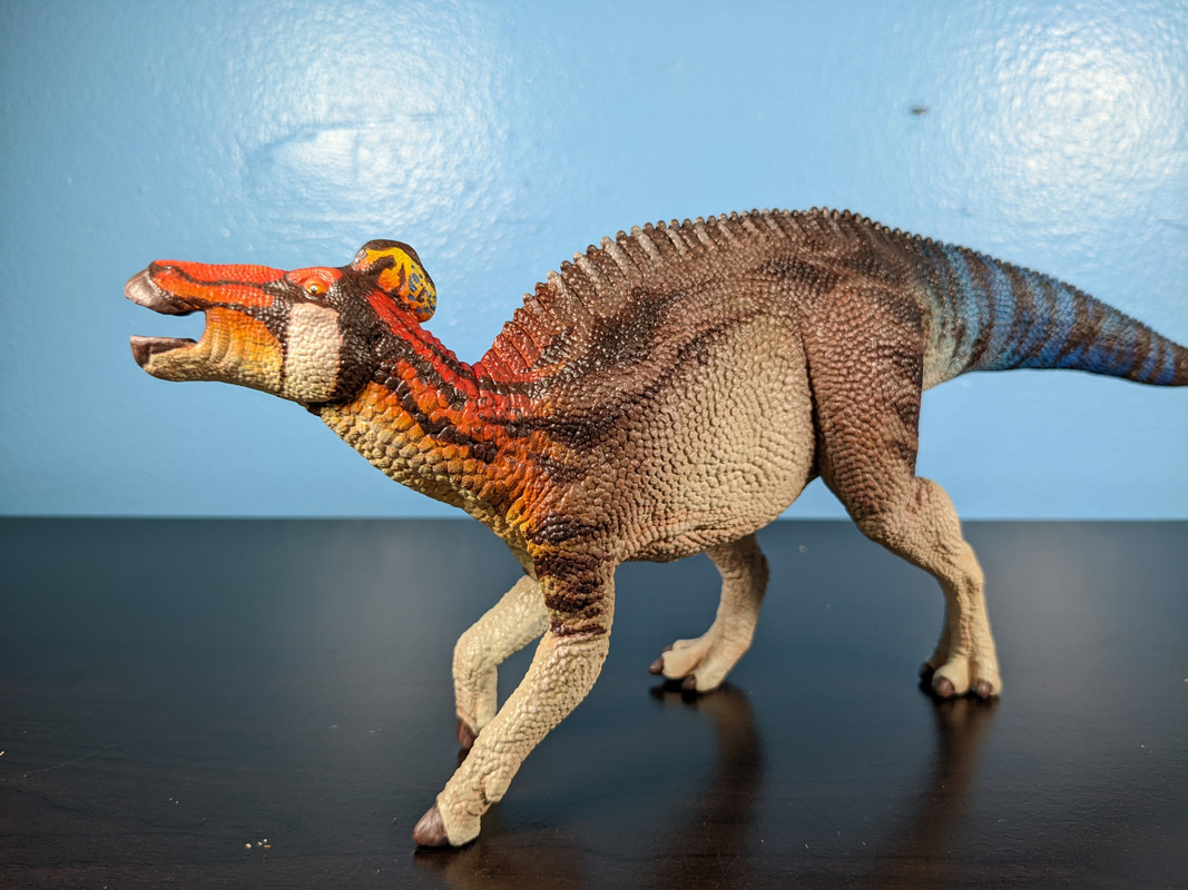

The head might be my favorite part of the whole figure. The way the black lines partition different areas of the head is so striking. I’m not much of a Star Wars fan, but the head reminds me so much of that edge-lord Darth Maul, I love it.
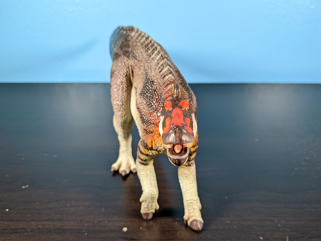
The pop of white on the “cheeks” is also a nice touch. It helps break up the other colors and gives adds another color tone to an already colorful figure.
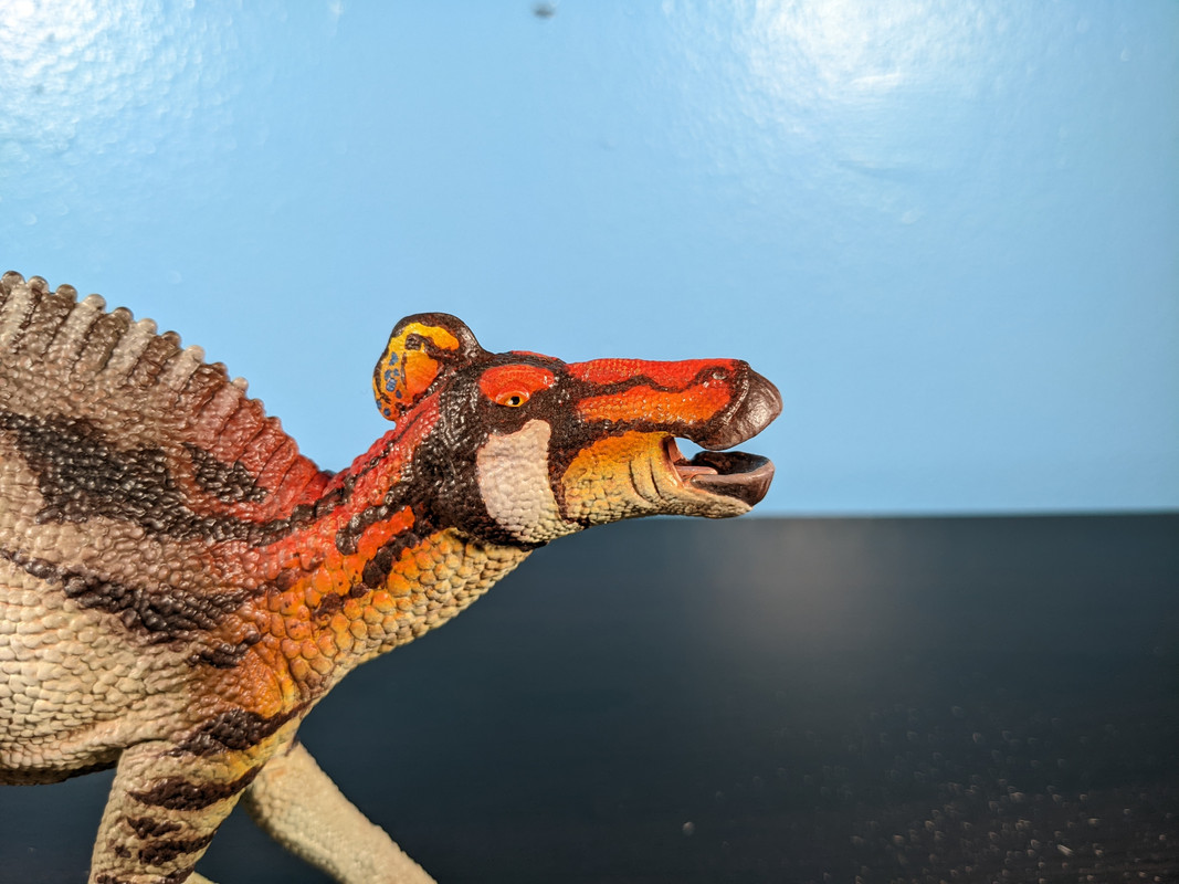
Oh, and that head crest. Somehow, amongst this sea of tones and vibrant patterns, this head crest still manages to stick out. I mean “stick out” in the best way possible; it was a display feature after all, it should grab your attention. Still, it doesn’t feel like it comes from a completely different animal; the red, black, and those few hints of blue connect it to the rest of the colors, but the yellow makes it clear that this is a special structure.

This is truly a dinosaur model that will always catch my eye. I haven’t put it on the shelf just yet (my display is a mess at the moment), but I’m going to make sure it’s easily visible, because I just love looking at it.
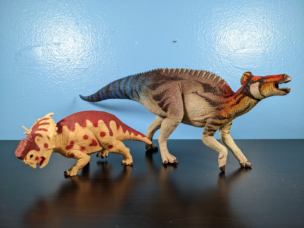
I have to give a huge thank you to paintingdinos for creating such a flashy paint scheme and making it work so well. Along with her Shantungosaurus custom, my late Cretaceous shelves are going to look like a hadrosaur rave, and I'm 100% ok with that.
